The Business Problem
This client was not struggling with traffic quality or product depth. They were struggling with what happened immediately after signup. Qualified users entered the trial, faced an overloaded interface before reaching any useful outcome, and dropped before the product had earned trust.
The baseline business picture was clear: a complex analytics product, strong acquisition intent, and weak conversion from trial to paid. The problem was not feature scarcity. The problem was a delayed path to value.
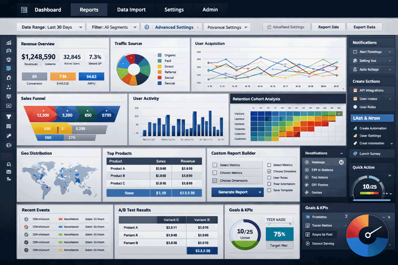
New trial users were landing inside a dense dashboard before the product had established any immediate value.
When users meet complexity before they meet value, the product feels harder than it is. That is not a visual problem. It is an onboarding architecture problem.
The Diagnosis
UXGen mapped the journey from account creation to first meaningful outcome. The friction was structural. Users were verified, dropped into a high-density interface, shown multiple navigation options, and asked to interpret empty analytics states before they had connected even the minimum required data.
The onboarding path was effectively asking users to understand the whole system before receiving a reason to care about it.
| Diagnostic Point | What UXGen Identified |
|---|---|
| Cognitive Overload | Too many widgets, choices, and navigation paths were presented before the user understood what to do first. The interface exposed system complexity before user value. |
| Weak Empty States | Blank dashboards and “no data” states acted as dead ends rather than guided launchpads, which lowered confidence and increased abandonment. |
| Delayed Aha Moment | The product did not create a fast enough path to a first useful insight, so high-intent users lost momentum before the product demonstrated its value. |
The Empty-State Problem
One of the highest-impact changes was reframing empty states. In the original experience, a blank dashboard looked like failure. Instead of helping the user progress, it increased uncertainty.
UXGen turned those empty states into guided decision points with one clear action: connect the first data source and move toward the first useful output. That change mattered because it replaced passive confusion with directed momentum.
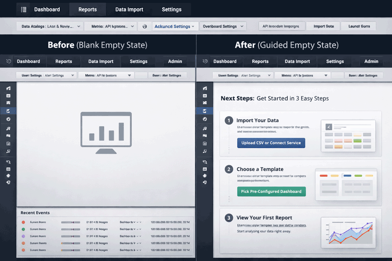
Empty states were redesigned to move users forward instead of leaving them stuck in a blank interface.
The Intervention
The goal was not a redesign for its own sake. The goal was to shorten the distance between signup and first value. UXGen applied progressive disclosure so users saw only what they needed when they needed it.
Instead of exposing the full dashboard immediately, the product introduced a focused 3-step setup sequence: define the primary outcome, connect minimal required data, then generate the first useful insight. Advanced controls appeared only after that sequence was complete.
Before
Trial signup
Full dashboard and settings
Confusion, scanning, abandonment
After
Trial signup
Guided 3-step setup
Step 1: Choose the primary outcome
Step 2: Connect minimum required data
Step 3: Generate first useful insight
Advanced controls revealed after first value
The important shift was sequencing. The product stopped asking users to understand everything up front and started earning attention one useful step at a time.
Measured Outcome
Trial-to-Paid Conversion Rate
| Metric | Before | After |
|---|---|---|
| Trial-to-Paid Conversion | 3.2% | 8.5% (+166% relative lift) |
| Time-to-Value | Not clearly established | 9 minutes |
| Implementation Scope | Dense dashboard first-run experience | Structured onboarding + IA changes |
Revenue Impact Model
This case study should be read carefully: the revenue number here is a modeled upside, not a claim that UX alone magically printed money. The value of the intervention came from improving conversion inside an already active acquisition pipeline.
How the upside was framed
The client was already generating substantial monthly trial volume. By reducing Day-1 friction, increasing first-session value, and improving trial-to-paid conversion from 3.2% to 8.5%, UXGen modeled the annual revenue upside from better conversion inside the existing funnel. The key point is not the headline number by itself. The key point is that onboarding friction was suppressing revenue already present in the pipeline.
Why This Case Matters
This project is useful because it shows a pattern common in funded SaaS products: teams keep adding capability while users still struggle to reach first value. When that happens, growth problems get blamed on acquisition, pricing, or product depth when the actual bottleneck sits in onboarding logic and information architecture.
The lesson is simple: if new users are meeting system complexity before they meet product value, conversion will remain weaker than it should be.